


Crafting and Falling for a Book Cover
The Story Behind the Cover of The Town of Perpetual Autumn

“Don’t judge a book by its cover,” they say. Its age old advice meant to prod people into looking beyond appearances. But, in reality, that doesn’t directly apply to book-buyer psychology. Readers will judge a book by its cover. It’s only natural for them to.
Unless you are a widely known author, you can get away with a dry book cover; mainly because people already love your writing style, your stories, and will invest in them again, even if the book cover doesn’t stand out. However, the opposite is true for emerging authors.
The Reader-Buyer Psychology
Personally, when I was starting out, I knew that any chance I had with someone reading and buying my book would start with a good first impression. I was basically a nobody, so why would anyone want to buy my book? So, as a reader myself, I worked on what I knew and focused on the psychology of a book buyer.
After observing and researching, I eventually categorized book buyers into two types:
Bookish Person A
They go to the bookstore or an online bookseller platform with a mission. They know exactly which book to buy, and from which author, because they’ve seen the cover and the title somewhere, which intrigued them enough to search and read the reviews and the premise. If they like it, it’s sold.
This is the reader I wanted to have. This is what I wanted to achieve for my book. I wanted my book sold in the mind of a reader long before they even held it in their hands.
Bookish Person B
They love surprises and going in blind. They go to the bookstore with a loose idea of what they’re in the mood for reading
Usually they do this: (1) Go to bookstore/online bookselling platform (2) Browse (3) Quickly sift through titles and book covers that make them stop and look. (4) Pick up the book/click on the book that interests them (5) Check out and invest in the books that meet their personal criteria for taste, price, and mood
This reader is harder to catch—so to speak. But it’s not impossible to do so.
Now, what do Bookish Person A and Bookish Person B have in common? They both have the same entry point upon meeting the book: The Book Cover
A Well-Planned Book Cover is Crucial
To say the book cover is important for an indie author would be an understatement, because a book cover is crucial to landing a sale.
While a well-written, well-planned book will land you readers, and loyal ones at that, for them to read your well-written book, they need to know it exists first. You can do this by catching their attention with your book cover and putting your book out there where they can see it.
In a physical bookstore, you want readers to literally pick up the book, as by then they are 70% more likely to buy it. As a reader myself, we usually pick up book covers that make us go, “Ooooh, this looks interesting,” and the rest is history. This is akin to online readers placing books they like in their carts. The only thing they have to do next is make a purchase.
How a Book Cover Rounds out Everything
You can’t really touch on the topic of book covers without talking a little about branding, and marketing. So I’ll keep it concise; before creating your book cover, you need to know your ideal reader first and then plan accordingly. This article by Kristen Kieffer is insightful about determining your ideal reader.
That said, I’d like to use the book Vital Signs edited by Dr. Ronnie Baticulon and Marjorie Evasco as an excellent example of knowing your ideal reader, and doing it right. You can buy the book here.
")
This book is a compilation of 13 Filipino short stories about doctors and their patients, and focuses on their shared stories on well-being, healing and resilience. It’s a poignant and emotional read for readers who don’t mind delving deep into deep themes that involve sickness and healing. The cover is tastefully done and catches the attention of the right reader. It looks like a painting, with nothing particular meant to stand out (and I feel this was intentional), and the font is straightforward for the reserved, philosophical reader who has seen their fair share of trails in life and seeks to be inspired by this book. Even the illustration has a more folkish feel taking inspiration from contemporary Filipino art. This is a good decision for the cover, since it talks about Filipinos and their healing stories. Using a muted red was also a wonderful touch because red is a bold color, which promotes empowerment.
Next is my book, The Town of Perpetual Autumn. It’s a book about—of course, autumn, and the characters that experience love, loss and self-discovery in this perpetually autumn town. You can buy the book here.
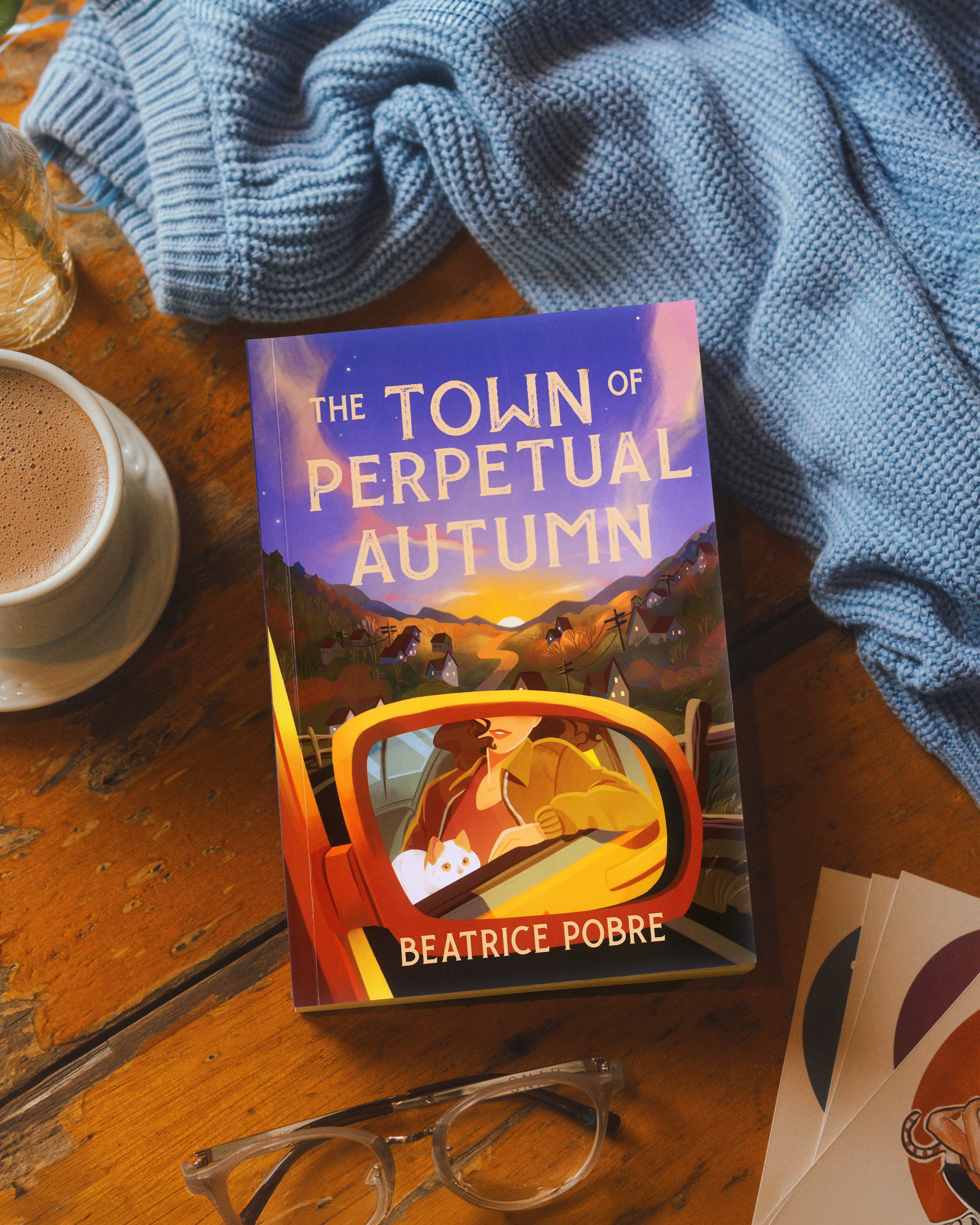
So based on the premise and the title itself, the book is cozy, so the cover has to illicit that feeling of comfort, and what’s more comforting than the sight of a setting autumn sun? This is also means I had to stick to colors that were associated with the autumn season. That meant no summer or spring colors such as blue, yellow, pink or green. I focused on browns, ochers and purples, which mimicked perfectly the autumn sunset I wanted to achieve. I decided against making the book look like a YA novel because my characters were in their early to mid-30’s and I believed working-class readers would like this book the most.
To round it all out, you’ll know you achieved your goal of making an eye-catching cover if your readers say so. Sometimes I receive messages from people who said they loved the cover and wouldn’t have found my book (and loved the story), if they didn’t first love the cover enough to give it a second look.
How I Found an Illustrator
I started where everyone must always begin: research.
I knew off the bat that I wanted an illustrated cover. My decision is based on in-depth research of my options; this information will show you my thinking process. A vector rendering wouldn’t do, a photographed book cover wouldn’t do, and a cartoon style book cover wouldn’t do either. So I set off to look for illustrators who had the style I had in mind for the book cover.
I reach out to illustrators (or anyone I want to work with) via e-mail, never through chat, DMs or the like. It’s dicey and difficult to keep track of replies that way. As a standard practice, I prepare a cold e-mail that starts with a warm greeting, and then an emphasis on how I found them, what I love about their work, and then talk about the project, what my vision is, and finally inquire what their rates are. I always keep it cordial and professional, and when done, I send them the email and wait for them to respond.
Once they respond, the vetting happens.
My questionnaire for choosing the right illustrator is:
Does their style match what I envision for the book cover?
Can they design the title into the illustration1
How excited are they about the project?
Do they have a strong portfolio online with positive client testimonials?
Are their rates fair (considering you are an indie author)?
Are they timely in their responses?
Do they communicate with you effectively and professionally?
After taking about a month canvassing artists for TToPA’s cover, I made the best choice of choosing Dubai-based Filipina illustrator Jane Pica. Needless to say, she did an amazing job and was very professional throughout the whole process. It was a dream to work with her.
We went straight to work after deciding on a timeframe, and the rate and how many revisions were acceptable and the copyrights. We placed it all in a service contract, and then signed it together.
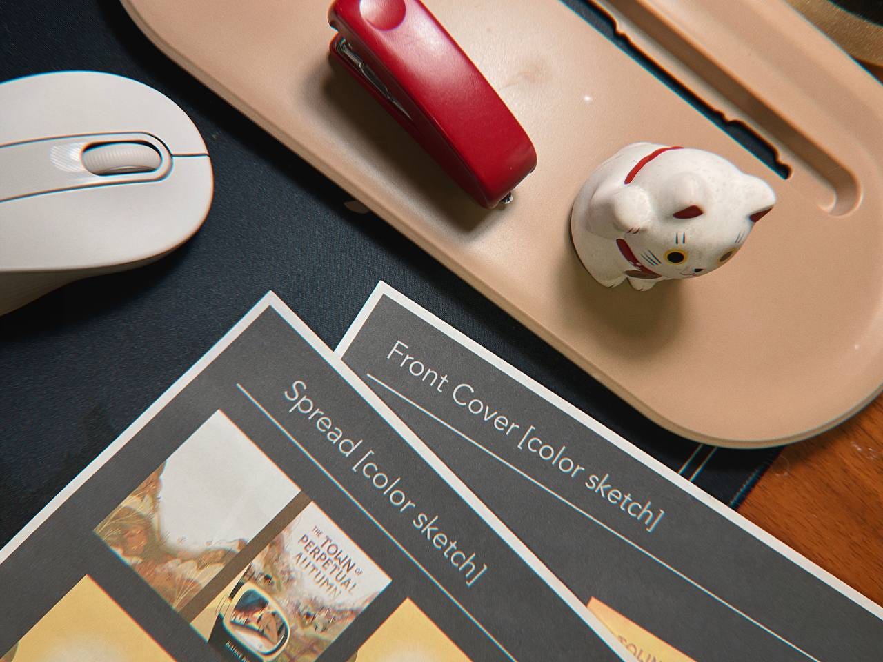
The Process
The process will vary per illustrator, but with us, there were initial sketches, then color study and final image with the title and room for some revisions. Below were the initial sketches sent by Jane.
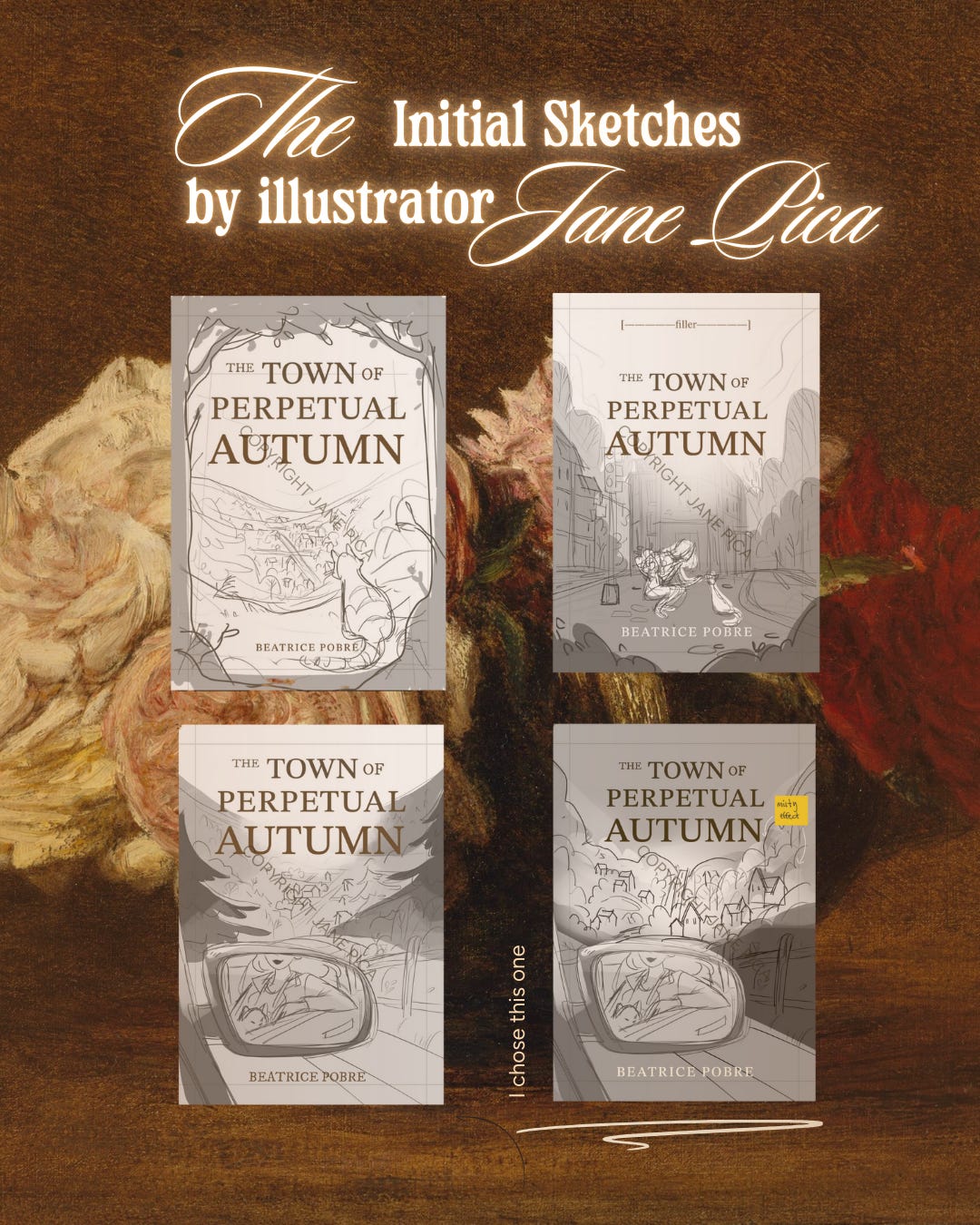
After a few collaborative ideas, Jane ended up creating such a beautiful cover for my debut novel. In the end, I believe it hit everything I wanted to achieve. It helped me find my ideal readers, and get noticed in physical bookstores like Fully Booked, and online. Most importantly, it helped me send the message that my book is a good contender in the global market, because I believe more Filipino authors need to be noticed, and it can start with a great book cover.
I’ll be posting about this with more infographics on my Instagram page on May 22nd. Feel free to follow me there if you want to read more about the writing journey and the creative process of an author.
Book illustration is usually a separate service from book designing. But in some cases, other illustrators offer simple title placements as part of their service package.